The wedding publication world can feel like a big, mysterious place if you don’t know what editors are looking for when it comes to submissions. As an editor, rejecting a submission is the worst part of the job. It sucks to be the bearer of bad news and let someone who is so proud of their work down. Just the other day, I had to respond to a frustrated wedding photographer who did not understand why we rejected their work several times in a row. In drafting my response to this photographer, I started realizing that the list I was building is a list that we haven’t shared before with our wedding photography community. So, if you’ve ever been frustrated about having your submissions rejected and you’re truly at a loss as to why your work isn’t getting picked up, then this list is for you.
1. Inconsistent/Over Processed Editing
While most editing tends to flatter and be consistent throughout a submission, we do receive quite a few submissions that feature inconsistent and/or over-processed editing. While the individual photos are pretty, on their own, the wedding has a whole doesn’t flow consistently from one image to the next. What do I mean by that? One image is blue and dark and the next is so overexposed that the viewer can’t see any details. Another editing issue that pops up from time to time has to do with unnatural skin tones.
While this tip seems like a simple, common sense item, I feel like it’s totally worth mentioning given the number of submissions we turn down for this reason alone.
2. Poor Image Selection
If you’re a follower of our blog, then you know that we love to feature a few things in every wedding that we publish:
- Photos of the bride and groom’s fashion
- First looks/sentimental getting ready moments
- Ceremony decor (aisle markers, ceremony arch, florals, etc.)
- Bridesmaids and groomsmen style
- Couple portraits
- Reception decor (table decor, bar set-up, cake, dessert table, etc.)
- Fun exits
Every publication has their own unique recipe. You need to figure out what a publication’s recipe is before submitting because you’ll want to make sure that you’re sending the right photos. We actually receive quite a few submissions where half of the day is missing or there aren’t any photos of just the bride. The photos that you love from a wedding might not be the photos that end up getting shared, so try to think about which photos from a wedding match a publication’s recipe the next time you’re curating a submission gallery.
3. Too Similar to Other Features
Remember when Iceland was everywhere? Well, I really, really remember, because we’re still receiving Iceland submissions on a weekly basis. When the trend first started, we picked up quite a few of the Iceland submissions (real weddings, styled shoots, etc.). After featuring Iceland once or sometimes even twice a month, we started getting Iceland fatigue and we noticed that our followers did, too.
Fast forward to 2018. We’re still getting submissions for Iceland weddings/shoots, but we’re accepting a lot fewer of them because we’ve already featured too many. Part of what we’re trying to do here at Junebug is to inspire our readers with amazing real weddings from all around the world, so if we only ever featured Iceland weddings, we wouldn’t be doing our job.
Similarly, we receive a ton of submissions that seem to be inspired by weddings from our blog or that feature similar details, fashion, colors, etc. These are beautiful weddings, but the problem with these submissions is that they don’t offer our readers something new.
To summarize, don’t submit a wedding to a wedding publication just because you’ve seen them publish something similar. Make sure that your submission offers something new!
4. No Pinnable Photos
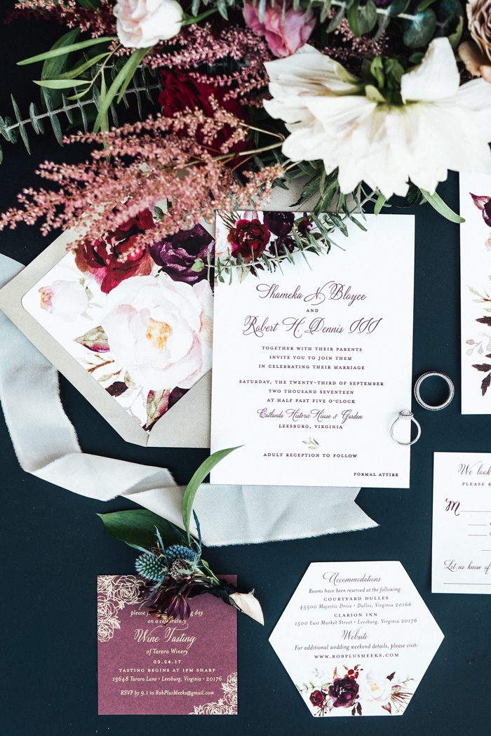
One of the biggest traffic referrers for most digital wedding publications is Pinterest. In fact, Pinterest is our second highest source of traffic next to Google. So it’s no wonder that we want to feature content that performs well on that social platform. To ensure that the real weddings that we feature receive a lot of Pinterest love (which benefits both us and the vendor teams), we only accept submissions with pinnable photos, i.e., photos that will get repinned on Pinterest. Photos that do well on Pinterest are usually vertical (portrait-oriented) and provide utility to couples planning their wedding.
The best way to learn what type of photos we’re searching for when it comes to Pinterest promotion is to follow us!
5. Not in Chronological Order
My last tip is honestly just common sense! In order for an editor to be able to visualize what the feature will look like, it’s easiest if we’re looking at a submission gallery that’s in chronological order. It’s very difficult to digest a wedding if the photos are all out of order.
Get. Those. Photos. In. Order.
For more tips on getting published, check out what the editors of Green Wedding Shoes, Rock N Roll Bride, Bridal Musings, and more have to say about their biggest submission turn-offs.
